Tips on designing hex stickers for #rstats packages
Earlier today on twitter, Eric asked me this question
Looks terrific! What is your workflow for designing these? I may try one for the podcast soon
— The R-Podcast (Eric) (@theRcast) January 31, 2019
Immediately after I replied I was using SketchApp, I realized he might be asking me about the actual “design workflow”. On this aspect, although I feel like I’m not the best person to say this but I did gain some experience through making the following 5 stickers. Now let me try to organize the thoughts and put them down.

I’m not an artist and I guess my only “systematic” design training is to “seriously” read this Dota 2 Workshop - Character Art Guide (yeah, I’m a useless dota2 player and my skill is really bad 😐), which was written to help guide community artists make clothes for heros. I mean although it sounds like a joke, the document itself is actually a very good Design 101 class. It mentioned quite a few points that might seem to be too basic to designers but good for me at least.
(The copyrights of all the screenshots that have monster-ish things belong to Valve.)
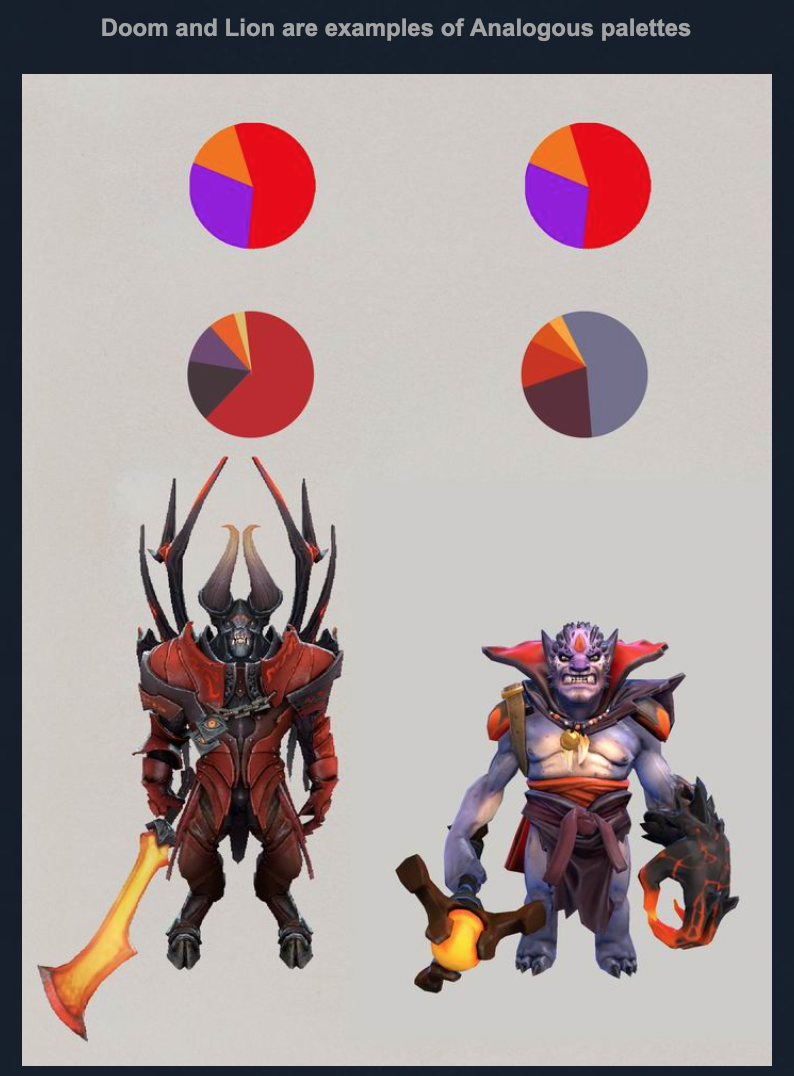
Selection of Colors
On the aspect of color picking, the dota2 doc tells me I should not pick more than 3 colors. “Less is more” it says.
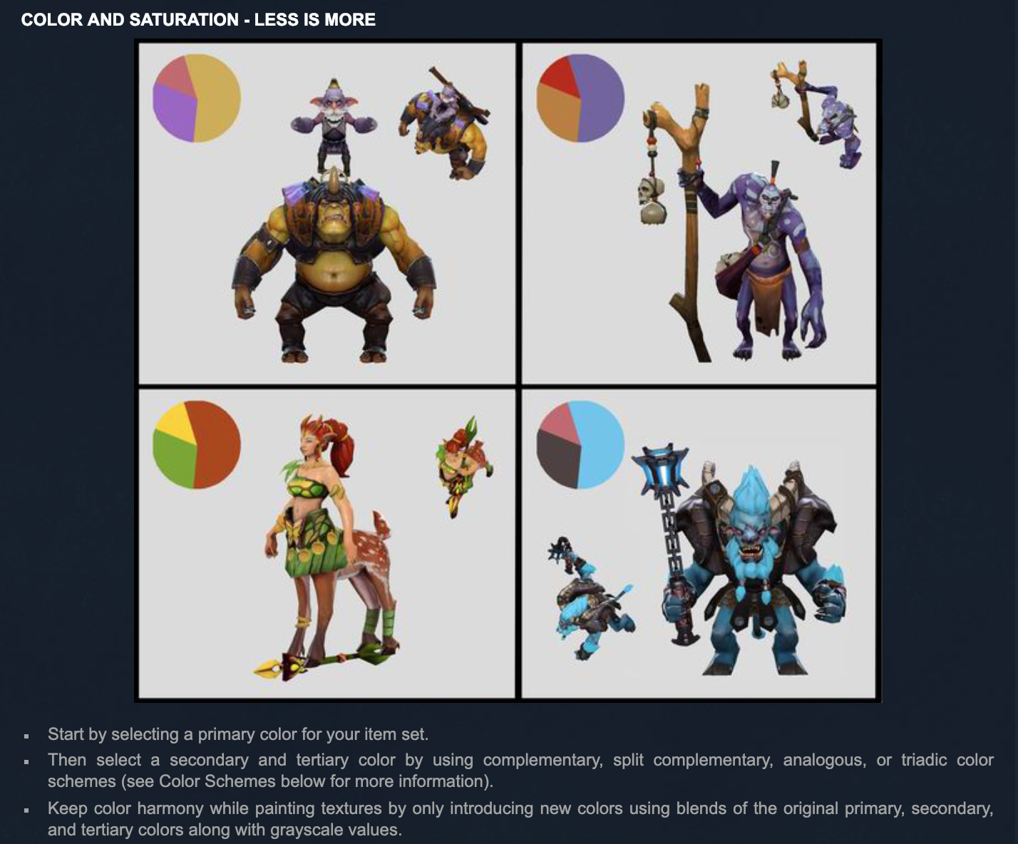
I think this point is critically important when we do design on small places like stickers. In most cases, a mixture of too many kinds of color is just not a good idea (Tidyverse itslef is a collection of many kinds so I’m not discussing the design of that sticker here). In fact, if you check the design of all rstudio’s official stickers, you will find in many cases, they even only have 2 colors.
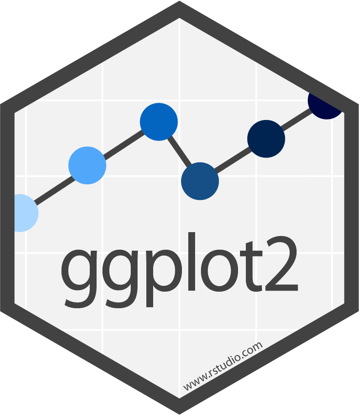
If you are looking for an example with 3 colors, ggplot2 is a good example of combine the signature “ggplot gray” with black and blue on the aspect of color selection.
Focus on the Package Identity
If you have tried to read that dota2 design doc, you will find it was reiterating the importance of “hero identity” again and again. The same rules applies to sticker design. When you are trying to come up with an hex-shaped image, the easiest routine is to think about what makes the package unique and if there are any good ways to visualize this “identity”.
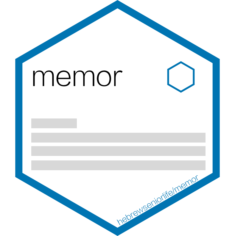
In the tinytex example, when I was brainstorming the ideas on my commute, I immediately recognize the power of the word “tiny”. How can we visualize the concept of “tiny” - a magnifier might do the job! That’s how this design came up.
Package “Family” and Color Key Palettes
Heros in Dota2 have family. So they sometimes color heros with the same origin using the same color palettes.
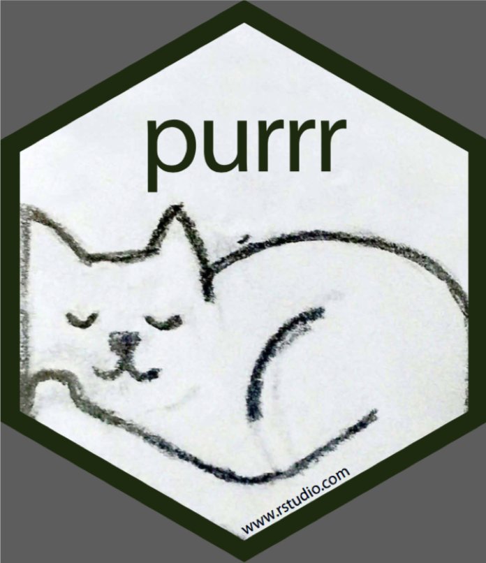
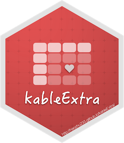
R packages have “family” too. For example, my kableExtra package makes final tables in rmarkdown so it certainly blongs to the rmarkdown group. Since most of the stickers in this category are kind of “red-ish”, I also gave this kableExtra sticker a red color background to allow it to fit into the family.
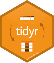
Another example is dplyr, tidyr and broom. Do you have a desire to use them together?

Software
Finally, as I said in my tweet, at least for me, SketchApp is my go-to software to make these stickers (I’m not sure how rstudio folks made their stickers though). It offers many great functionalities for graphical design, such as adjusting the inner/outer width for polygons, setting up filling patterns and mask two layers together. Very good software.
Again, thanks for reading my random thoughts! Keep in mind that the things you just read came from a design newbie like me so don’t treat this post seriously. After all, if you have the ability to draw cute cats on paper, you don’t need to worry about anything I just talked about. :P